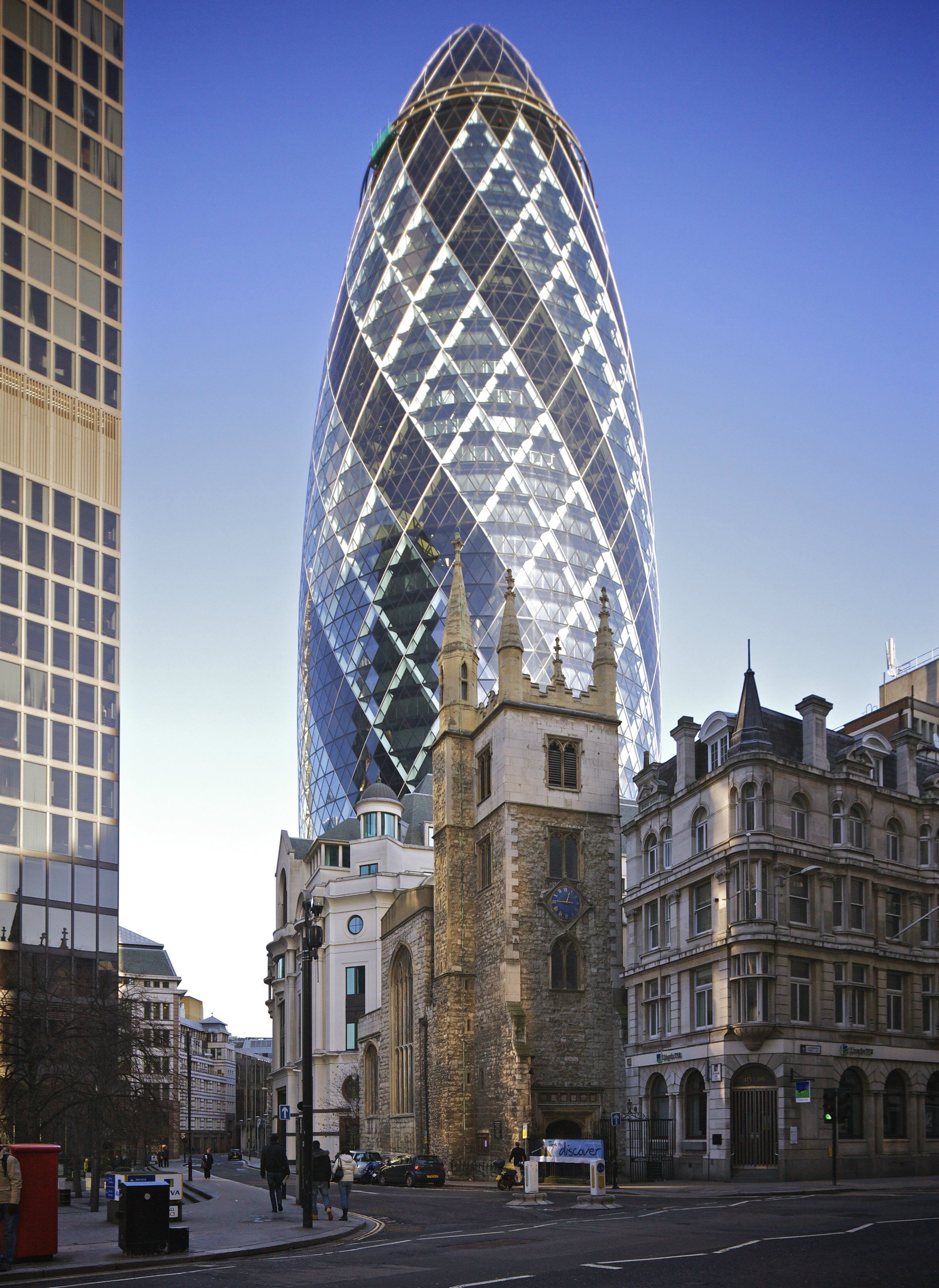
This is the London building popularly known as "The Gherkin". I am sure many people hate it, that's always true of the radically different. But at least you can't say that it does not make an impression! It's only from 2004, but already one of the most famous buildings in London, always used in films etc, like the Eiffel tower is for Paris.
Here's a whole 'nuther thing though, if you look at the full-resolution image on Wiki, you'll notice that at 100% (called "pixel-peeping", because in print you often don't notice the flaws which look so blatant on the screen at 100%), the top of the building looks awful, blurred.


So why is it so blurry on the main subject? (And why the heavy vignetting, dark corners?) Well, the guy had his camera set at Aperture Priority, and set at full aperture, 3.5. And no lens in the world is at its best at full aperture, not even such an expensive one. Some lenses are good enough at full aperture, but they are always better stopped down a couple of stops. (F:8.0 is usually one of the best settings, re sharpness.)
Further, he or the camera may have focused on the building in the foreground [Update: T/S lenses don't have autofocus, thank Andreas]. Though I'm not sure how big a difference that made at that distance.
Basically, unless you need to isolate your subject with background blur, or you're forced by poor light (not the case here, it was taken at 1/2000 sec), don't use your lens at full aperture if you want optimum sharpness.
Funny thing is that if the photographer had chosen to just let the camera select the settings, at "P", Program, setting instead of Aperture Priority, it would probably have selected something around 8.0 and 1/500th second instead, much more fitting.
Update:
Bert said:
...what really bothers me is how the perspective on the buildings in the foreground is so wrong. The tower in the center and rightmost (hotel-like) building really look like they are repelling each other!
I wonder if this is caused (or at least enhanced) by the extreme setting of the lens? I really don't know anything about those.
This special lens ("tilt and shift") allows the vertical lines of buildings to remain parallel, even though the camera is "looking up". It's important to architectural photographers, but I confess I find it debatable which looks less natural, the enforced parallels, or the converging verticals which we are used to from normal cameras.
12 comments:
This brings to mind one of my favorite photography quotes, F/8 and Be There, attributed to photojournalist icon, Arthur "Weegee" Fellig.
And:
- The lens was shifted pretty much to it's mechanical limit along the long side of the image. That put the upper image border as far from the optical axis as it can go. In those outer areas of the image circle the improvement from smaller aperture is needed most ...
- Most likely this wasn't shot handheld (at least it shouldn't have been ...) So he could have easily stopped down to the diffraction limit (f:11..16) and still have used the cameras lowest sensitivity setting (it actually was set at ISO 500!)
The settings f:3.5 + ISO 500 + 1/2000 sec couldn't have been much further from ideal.
Btw., the camera didn't focus the shot - neither Canon's TS nor Nikon's PC-E lenses offer AF.
And someone gave this image a five star rating in Aperture ;-)
Andreas,
I guess that would be the author. :-)
Good point about the shift.
Oh yes, they are not AF.
Thanks for the link, Russ, interesting.
Yeah, enhancing the male with a bigger camera is always a good idea. :-)
Is it radically different? I don't think so, not in the way the Eiffel Tower was. Anyway it looks more like a giant glass dildo.
It's funny, but what annoys me most about this image is neither the tip of the "Gherkin" nor the vignetting. In fact, I rather like the darkening sky effect the latter procures, at least on first impression, it does frame the subject in a lovely way.
No, what really bothers me is how the perspective on the buildings in the foreground is so wrong. The tower in the center and rightmost (hotel-like) building really look like they are repelling each other!
I wonder if this is caused (or at least enhanced) by the extreme setting of the lens? I really don't know anything about those.
P.S. Am I the only one to hate the "new" captcha with a passion? Dang, would I ever love to get my hands on the aholes behind that...
Some people think it very phallic, yes. One of the nicknames is the Crystal Phallus.
What is it about the new captcha?
This special lens ("tilt and shift") allows the vertical lines of buildings to remain parallel, even though the camera is "looking up". It's important to architectural photographers, even though I find it debatable which looks less natural, the enforced parallels, or the converging verticals which we are used to from normal cameras.
What is it about the new captcha?
Nothing much, other than the fact that they are mostly unreadable, bot or not!
I agree, but I think they've pretty much always been like that, the variety they use here on Blogger. Many are really unreadable. I don't get why they don't fix it, it can hardly be a secret.
They've been changed, recently, Eo; and...there are TWO, now! (I read about how MANY people have been complaining re: how difficult it is to decipher them so they went in and tweaked them a little. But...quite ANNOYING, all the same, I DO AGREE, Bert! At first, I thought that you (Eo) had changed it to add an additional word!
Oh, hey...thanks so much for: doing this posting, Eo; the website, Russ (looks interesting/helpful); and for Andreas' comments, as well. I am learning a LOT re: photography via this; thank you all.
(Wish me luck on my first round of captcha input! ;-) They really are better, now, though, but...TWO?! Oh, MY!! :-/ (no shit: CLEARLY stated and input but, NO SUCH LUCK! Now, the shit wants me to type "icestrum?!" DISGUSTING!!!! :-/
I agree, but I think they've pretty much always been like that,
They were once very unreadable then became so legible that I rarely had to re-enter or ask for another one. Now they've got back to unreadable.
Post a Comment