 It's clear that designing a user-friendly user interface is one of the really big challenges in technology. It's rarely done really well, and often disastrously bad.
I really like the Olympus Pen, but Olympus's menus... oh my gawd. (Maybe not "disastrous", but bad enough.)
I had only use the Pen Lite with auto ISO which I really like. But a couple days ago I wanted to change it to a specific ISO Setting. And despite my 13 years of experience with a similar number of camera, for the life of me I couldn't figure out how to do it!
I mean, setting the sensitivity, how much more basic does it get? Many cameras have a dedicated button for it.
It got worse, I had to hunt in the manual to find out how to do it. But I finally found it:
First I had to press the OK button to activate the "Live Control" screen. Hardly intuitive, the OK button is used to confirm settings, not starting them.
And then ISO didn't, contrary to my expectations, appear immediate and clearly on the Live Control screen. I had to scroll down beyond the first "page" to find it. Closer to the top was things like "focal length" (which I am not even sure what's used for, since most lenses tell this to the camera, it may be for the rarer instances that this does not happen) and Image Aspect Ratio, which I believe most users rarely change.
Sigh.
You would think that after well over a decade, camera settings had not only become pretty intuitive, but also found a set of standards, that they would be similar on most cameras. But far from it, they are all different, and most are pretty confusing.
Another example: the Olympus cameras have a "Super Control Panel", which handily displays basically all the important settings of the camera on one screen. But guess what, this is by default turned off! And to turn it on, you have to go deep in the menus and know exactly what you're looking for, you will never stumble over it on your own. (It's even called SCP in the menus, who would guess that that stands for.) I only heard about it due to an article which reader Bert helpfully referred me to.
Sometimes you almost miss the good old Pentax K1000, durable (though actually not that heavy), cheap, and ultra simple, it had the aperture and the shutter speed to set, and that was about it. It didn't even have a friggin self timer! The camera was made and sold for over twenty years I believe, particularly schools loved it, it was cheap, durable, and it taught the basics without fancy distractions.
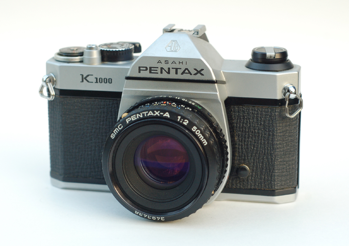
It also didn't have an on-off switch! You had to put on a lens cover to save battery. But it was fully operable without battery (of course without light metering though), a rarity. It sold over 3 million units between 1976 and 1997.
I never used it myself, I used a Konica TC and later a Pentax ME Super. I never used a manual camera, though it probably would have been good for me. Fortunately I liked to read about cameras (I tore through the dozen books about it the library had), so I picked up what aperture and shutter speed do.
15 comments:
I couldn't agree with you more. I don't understand how camera companies can even imagine that they are doing an adaquate job with in-camera user experience.
One feature that is rare but should be commonplace is the overexposure warning. Highlights that are 100 percent white (or nearly so) will blink or turn red when the shutter is pressed halfway.
Another feature I see very, very rarely is a LCD view which keeps the image uncluttered and puts the exposure info, remaining exposures on card, flash icons, and all of the other icons in a black margin below and to the right of the image.
Most displays are big enough so that a slightly smaller image that is not filled with information is much more desireable than a larger one that is.
Yeah. I got a Canon camcorder several months ago. Tried to do setup, etc., via the manual.
Try as I might, I couldn't get the menus to scroll. Now, I'm a computer guru since the first PCs came out, so WTF?
Called the support hotline. Turns out you don't try to move the scroll bar on the right (like every UI I've ever used), you gotta push or pull the menu lines up or down.
Go figure.
I have no idea how it happened, but for some reason the Pentax K1000 became known as the perfect camera for student photographers. I agree that the K1000 is simultaneously a gem and a workhorse. However, there were cameras from competing manufacturers that put out SLR's of equal quality during the same time period.
http://codex.bluemooncamera.com/2012/03/16/student-cameras/
I just bought a Pentax Spotmatic II ($20) and have been having a blast shooting it recently. It's about as simple as the later K1000 in that you have shutter speeds, aperture rings, and you have to get that needle to stop in the middle somehow.
ES, I got a Spotmatic for my birthday from a reader a few years ago (blogged it), it started my modest metal camera collection. It's a beautifully designed camera.
Russ, doubtlessly the K1000 was mostly like other cameras, which may have helped. As did probably the extreme simplicity, and simply the reputation as a good student camera, once that got going.
I got a Spotmatic for my birthday from a reader a few years ago [...] It's a beautifully designed camera.
What's the problem then? Why bring attention to cameras that are not beautifully designed, when there clearly are plenty of opposite examples?
In every field of technology, you can find rotten tomatoes. But concentrating on those, and thereby lending energy to their manufacturers, does not help the field in general.
It's clear that designing a user-friendly user interface is one of the really big challenges in technology.
Really? Bicycles, cars, aircrafts, ... all with poor user interfaces? Robotics, fusion reactor; you think the challenge is specifically in the user interface?
Many people think that the user interface in Nikon F1 was perfect. That was already 40 years ago. So, clearly it can't be that big of a challenge, if it has already been done so many times.
It was easier with the F1, it had less than 1/20th of the settings of a current digital camera.
Maybe I should be less negative, but sometimes I have to vent. And I wouldn't mention this issue if it were limited to very few cameras, but it's very common.*
Actually the new Olympus OM-D is physically, to my taste, almost as beautiful as the Spotmatic.
But it has the same confusing operating interface as the Pen Lite and many others.
I just believe that surely it can be done better. And if nobody ever writes about it, it's much less likely that the camera makers see that there is an issue. (Sure, my readership is not large, but the principle holds.)
*In electronics. A Sony discplayer I had, had a remote with the stop button right under the play button, and if you hit it by mistake, it didn't just take you to disc menu, but all the way out of the blu-ray, so you had to start it all up again (can easily take a couple of minutes with blu-ray). And there was no confirmation dialogue, unlike other places in the interface.
"In every field of technology, you can find rotten tomatoes."
The entire digital camera field is rotten. Manufacturers are in denial about it. Mentioning it helps to get the manufacturers out of denial.
"Really? Bicycles, cars, aircrafts, ... all with poor user interfaces?"
Yes, really.
Cars had poor user interfaces for many decades. People were dying because of this, but the car companies kept on making money despite the deaths. It took government pressure and intervention to clean up the user interfaces in cars. PRNDL is one textbook example.
Aircraft UI was very bad up to and through WWII. Controls on US bombers in WWII is another textbook example.
Bicycles did not start out as easy to ride as they are now. Look up penny farthing for more info.
"Cars had poor user interfaces for many decades. People were dying because of this, but the car companies kept on making money despite the deaths. It took government pressure and intervention to clean up the user interfaces in cars. PRNDL is one textbook example."
I'd like to know more about this. I've been driving cars, trucks, heavy equipment, motorcycles and such for 50 years and don't ever remember thinking that I needed the UI to be much different.
I agree that at the 50,000 foot level, the UI for cars has been relatively static. However, there have been quite a bit of diversity in the details over the years.
My next door neighbor had a Dodge Valiant that had push buttons on the dashboard to change gears (forward, neutral, reverse). They looked very similar to the buttons on the AM radio.
I used to drive my uncle's VW Beetle that was an interesting cross between a manual and automatic transmission. Although it had a 4 speed transmission that you controlled with a stick shift, it didn't have a clutch pedal. Whenever you grabbed the knob on the stick shift, the clutch would engage and put the transmission in neutral. It was very irritating for a driver like myself who liked to rest their hand on the stick shift!
I shoot Olympus and agree about the menus. Have great trouble with Nikon menus too. Canon menus atend to be a little better organized. My favorite are the Pentax menus. They tend to work the way I think and have a flow to them. They are also very similar from model to model. Thus I shoot my Pentax a lot more than my Olympus.
Teaching photography in adult education lets me see most all of the camera. People almost always have more trouble setting their Nikon and Olympus vs Canon or Pentax.
Had a tough time with a Canon once. Trying to clean the sensor. Camera wouldn't offer the choice in the menu unless it was set to manual. It didn't gray out the menu choice it just removed it. Looked and looked for something I knew was there.
thanks
barondla
Thanks, that's a good example. Who could anticipate that? They should have let the option stand, but if you selected it while not in Manual, simply give you the message: "this option is only available with the camera in Manual".
It was easier with the F1, it had less than 1/20th of the settings of a current digital camera.
I don't know if you meant this sarcastically or not, but it is funny. And it proves my point. :-)
Maybe I should have said that I was mainly thinking of user interfaces in modern electronics. They often suck molten muck.
Yes, they are much more complex, which is why this happens. But it can be done, as witnessed by the iPad. It has its flaws of course, but overall it's very intuitive.
"I'd like to know more about this. I've been driving cars, trucks, heavy equipment, motorcycles and such for 50 years and don't ever remember thinking that I needed the UI to be much different."
PRNDL got sorted out in the early 1950's I believe. In the beginning different manufacturers were putting reverse, drive, and neutral in different places on the transmission lever, making switching from one car (PRNDL) to another (RPNDL) dangerous.
My point is that 50 years ago, car UI had already been evolving for a longer time period than digital cameras have existed now. Also, it took several decades of innovation before bicycles became as easy to use as they are now.
From those examples, there is no reason to believe that digital camera UI design is anywhere near the pinnacle of evolution.
Post a Comment