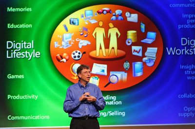

What better illustrates the different minds of Apple and Microsoft? (From this article.)
There is an anecdote that after Steve Jobs once publicly said that Bill Gates and Microsoft has no taste, he called Bill and apologized. He said that he should not have said so on the record, even though it's true! And what Bill said is that even though he himself may have no taste, it is unfair to say that Microsoft therefore does not. Funny.
9 comments:
Nicely said Lee!
(Sorry Eolake, I seem to be making a habit out of deleting comments today!)
:-)
I use both Macs and MS PCs - and it seems like Macs allow one to work without having to think about the technology behind the machinery. When working with PCs, I always have to be somewhat aware of technical information.
This was not the case in the first two distributions of OS X (10.1 and 10.2).
I am biased towards Microsoft, that's probably one of the reasons they hired me. But don't these contrasting view indicate one fellow seems to think a lot of himself? It's just him and the void. Kinda strange and probably not the best picture. The BillG pic seemed more friendly to me.
I suspect neither Jobs nor Gates have anything to tell anybody about big egos. :)But then they both can defend one.
One word: focus.
If you ever watch a Jobs keynote, you'll notice that his presentation graphics are simple, often one or two words. He hammers on single topics until he's done with them, then moves on to the next.
Apple's product design is like that. Elegant minimalism. If a feature doesn't fit, it doesn't go in, even if pundits are calling for it. (e.g. FM radio in the ipod.)
Gates is all about the feature list. His keynotes are scattershot, sort of like the graphic here, concepts all over the place. The only thing tying them together is Microsoft's "slogan du jour",
The feature list is the basis of MS's product design. If it can be built, it goes in, no mater how annoying, (e.g. "Clippy".)
Thanks for juxtaposing these two photos. Quite telling...
I thought Apple are bringing out a lead for the iPod which has an FM radio on it. I'm sure future iPods will have this feature built-in, as so many other MP3 players do. Unless it is down to legal issues.
The Gates slide looks superb. But it's really like Windows, a mass of basic children's colours, designed to appeal to the mass market. I'd have to hear both speakers to know who was the better one though.
Chris,
The iPod radio is going into the remote, rather than the the core iPod. I'd could me wrong, but I don't expect to see FM integrated for a while, if at all.
As for the Gates slide being "superb", I'd greatly differ. It's a nightmare from an information design standpoint. There's no loci of attention, the words on the screen are simply clutter. Even the colors, while pretty and pleasant, don't add any meaning.
Gates' presentation team would do well to read some of Edward Tufte's books in information design. I don't think Tufte gets everything right (he sometimes prizes information density over clarity), but it would go a long way to fixing some of MS's presentation problems.
Lee definitely said it best.
This is from a post of mine here:
"Today at the mall I went to the Apple store, and played around with the Macs there for a while. Mac > Windows. I didn't have any money with me (like I could afford $1600) but I'm going to have to get one someday. They rock."
I'm stuck using Windows now on my laptop. If only they weren't so expensive, I could have gotten a Mac instead of this Windows laptop.
Post a Comment