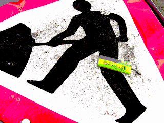
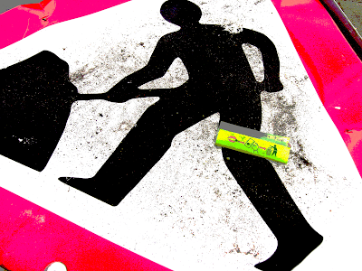
Apart from that, the photo is like the subject was found. The sign was on the ground, and there was sand and water on it, and the candy wrapper. (The candy user clearly did not follow instructions.)
I'm quite fond of this one.
Medium version (800x600):

Large version:

If you're curious, here is the original photo, with only a bit of contrast enhancement:

3 comments:
What I want to know is did they just mask of the lower bits, or did they use a weighting algorithm which would map to the closest color in the remaining target palette?
Was this an RGB image or a different colour space? CYK?
RGB.
I don't know how Photoshop determines which colors to keep when I reduce the color palette. I often get an ugly greenish color in areas where I was expecting grey tones.
Yeah, sounds like they just clear the lower bits. You'd think they'd do something more sophisticated.
This is more noticable on the duller/darker colours right. In the old days you'd have your 256 colour palette and you'd map several colours to one. You could see what was happening then...
Post a Comment