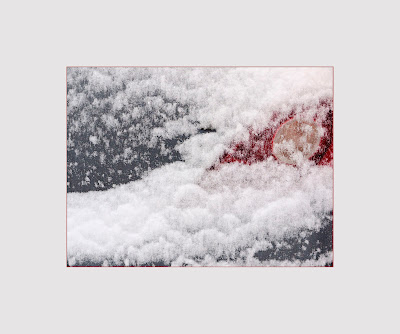
Sam suggested a red line:

I think it works pretty well, though it has to be a very thin line to not dominate.
I think I prefer the black-line version though. It could be just my conservatism speaking, I dunno.
-------
Panasonic G1, kit zoom. I used NIK Viveza to lighten the red without lightening the grey or white. It's an impressive app, very quick and intuitive automatic masking based on colors. It would be near impossible to make a mask for just the red in Photoshop (because of the raggedness of the edge), although you could approach the effect by simply a feathered rough mask.
9 comments:
couldnt you just adjust the red without using a mask in photoshop?
You'd think, but I am not aware of a way that's as simple.
See here.
I imagine go to hue/saturation or selective color and choose red and then adjust the lightness or black level
I wonder how it looks with a red line instead of black. Would you want to give it a go?
Interesting idea. I might.
OK, done, reload the post.
It sure looks dominating, the red line. But, now that I'm switching back and forth between the two pictures, I find the black one also dominating! Silly, as I'm sure that it wasn't when I looked at it for the first time ...
Also it's hard to see how it looks like with such small on-screen images. Did you actually print it?
Not the red-line one.
I do like the black-line one though.
Post a Comment