(Click for big pic)
(1600x2650px high-distance version)
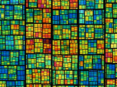
The second one reminds me of a big, lively, alien apartment complex. And the last one of a map or arial photo, obviously. I quite like the last version, linked-to (since Blogger has a max rez of 1600x1200). But it's my creed that there's no need to interpret art, and no interpretation is the "right" one. Then it wouldn't be art, but journalism.


14 comments:
I find it interesting that I much prefer the first over the second. Probably says something about the proximity of the viewer to the subject. Thanks for the link.
I too find the first one very pleasing to the eye. I guess it's because I've always had an affinity for stained glass windows!
The first is similar to stained glass, but the grids don't align right. The large grid should overlay the small grids, else little shreds show up, which would never happen with stained glass. I certainly like the color scheme and thought put into it, though.
The second one is very much like a Guatemalan Mayan skirt weaving. I have several at home, but don't wear them much, ;-)
The third reminds me too much of Seattle in the winter -- too much dull color, kinda depressing, not clear and sharp.
I don't understand the fourth one at all.
The fifth one looks like the recon photos taken by an F-111 during the Cuban Missile Crisis, set up for grid interpretation by analysts at the CIA. Except the grid rows are not normally offset. I stared at it for a while with my eyes unfocused, but no Hidden Picture jumped out. This didn't come in from SETA, did it?
Anyway, I like #1 and #2 a lot. Thanks for making them.
I quite enjoy the frond-like nature of the 3rd an have set it as my background. Works well.
Thanks, Eo!
The third one is a great pattern for a roller blind.
Love every one of them. They brought to mind, Mondrian: http://www.google.com/search?q=mondrian&hl=en&biw=1175&bih=590&prmd=ivns&tbm=isch&tbo=u&source=univ&sa=X&ei=YrcMToufA4rmsQPK7b2PDg&sqi=2&ved=0CFEQsAQ
As for Dave's comment about stained glass overlap: IMHO I think that's what would make yours distinctive in stained glass.
The top one strikes my fancy. I'm going to save it for when I get tired of my current wallpaper.
It's interesting how we all see something different. Whereas Dave says 'I don't understand the fourth one at all.' Well neither do I, but I'm not sure understanding is a prerequisite for appreciation. Do you understand women? I think the fourth one os most appealing to me because of the asymmetry as well as the black and gray palate.
Blecch!
Very classy!
Kevin, yes I think the misunderstood need to "understand" something is a block to much enjoyment of art. There's no need to "understand" a message in or what Mozart thought about when he wrote his 5th.
Thanks for all comments, guys.
Hi this is Sally!
I prefere the first one. It reminds me of the catholic church. I would like to have it as wall-paper somewhere...
There's no need to "understand" a message in or what Mozart thought about when he wrote his 5th.
Anyone who thinks like that could never have any real appreciation of Mozart.
Among the variety of roller blinds, blackout is the type that helps you to prevent light penetrating into a room. Though this is thought to be the basic function of blackout roller blinds, they are also used for insulating and protecting the furniture you have.
Post a Comment