Here's a hint for webmasters and -designers: A home page should present
all the basics. For example, I checked out some graphics software, and I could
not see on the home page what platform(s) it supported, and there was no obvious choice as to where I could click to find the information. I looked it up at Wikipedia, and of course that info was right near the top, as it should be.
---
ducloqu said:
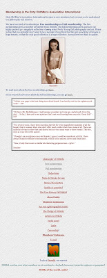
I would be interested to see how DOMAI looked in 1997.
Here you go. (Might be 1998) (The top painting is
my own):


10 comments:
One of the frustrations of the interwebs, as a lot don't seem to get the idea, and become intoxicated with "dancing bears".
Eolake, your sites are clean and straight ... good on you.
"Thirteen years of gorgeous girls", I read.
I would be interested to see how DOMAI looked in 1997.
Last year I salvaged some of it from the Internet Time Machine. I've updated the post with some screenshots.
Thank you. Yes, those are 1998 archives. Interesting that the underlying style (albeit developing a little beyond the linear list paradigm of the times, retains those bordered table cells like a potter's thumbprint in the clay) has lasted you so well--no dancing bears anywhere in sight.
"The full membership gives access to our highly praised 40+ megabyte collection"
Yeeeeha! Back when I authored my first website without being able to connect to the Internet, the HD in my Mac SE was 20MB and in my Mac IIci a whopping 80MB. Today my camera takes memory cards measured in GIGS and the pictures are almost 17MB each. My standard target size for pictures on the web has not changed: 40KB. I just hope they are loading a bit faster than they did back in the day.
Yes, it's hilarious, today a typical *daily update* is 40 megabytes! Back then it was a sizeable web site!
(And I'm conservative. Some pron sites update with several gigabytes per day. Insanity.)
Yep, dancing bears get so tiring.
the double-edged (!) table border for quotes (like the quotes here), I invented a couple of years later, and I was very proud of it, I don't think anybody had used it before.
"the double-edged (!) table border for quotes... I invented a couple of years later"
Better check that claim out with Dave Raggett (The Father of the HTML Table):
http://www.w3.org/People/Raggett/
"March 1995: A furor over the HTML Tables specification
Dave Raggett's HTML 3 draft had tackled the tabular organization of information in HTML. Arguments over this aspect of the language had continued for some time, but now it was time to really get going. At the 32nd meeting of the IETF in Danvers, Massachusetts, Dave found a group from the SGML brethren who were up in arms over part of the tables specification because it contradicted the CALS table model. Groups such as the US Navy use the CALS table model in complex documentation. After long negotiation, Dave managed to placate the CALS table delegates and altered the draft to suit their needs. HTML tables, which were not in HTML originally, finally surfaced from the HTML 3 draft to appear in HTML 3.2. They continue to be used extensively for the purpose of providing a layout grid for organizing pictures and text on the screen."
http://www.w3.org/People/Raggett/book4/ch02.html
Oh, I know they were used. I'm only talking about the edge, which I made into a frame by making a visible 1px border and a 9px cell space.
"I'm only talking about the edge..."
So am I. Here are a couple of BigNoseBird tutorials UPDATED in Jan. 1998 (and predating the earliest DOMAI pages on archive.org by 10 months)
http://tr.im/WjZo
http://tr.im/WjYG
All right.
Post a Comment