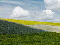
Michael Reichman illustrates what light does for a picture.
I am not sure if he means to say one of them is superior. I like both of them.
I suspect most people will like the one with the dark foreground best, since it has more depth. But I may actually be leaning towards the other one. I tend to like the abstractness of very flat pictures.

You must have seen "Dreams" by Akira Kuraswa. There is a segment where he dreams of Vincent Van Gogh...
ReplyDeleteThose windswept fields make me think of Miyazaki.
I'd opt for both to be displayed on the same wall.
Pretty. Both. :-)
ReplyDelete